Since we were already a part of the beginning, we took advantage of what worked and what didn't in the past branding, to encompass this new identity.
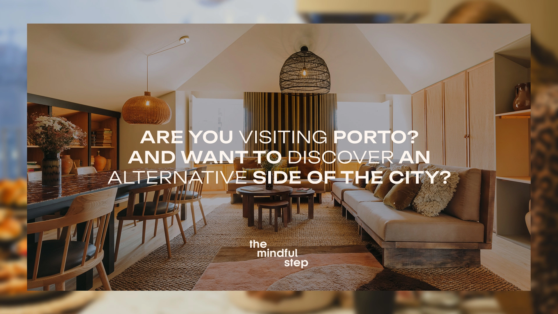
Alternative side of the city.
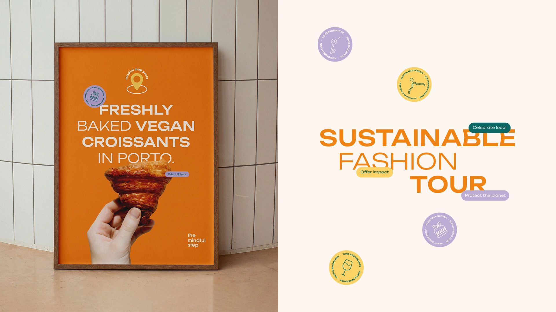
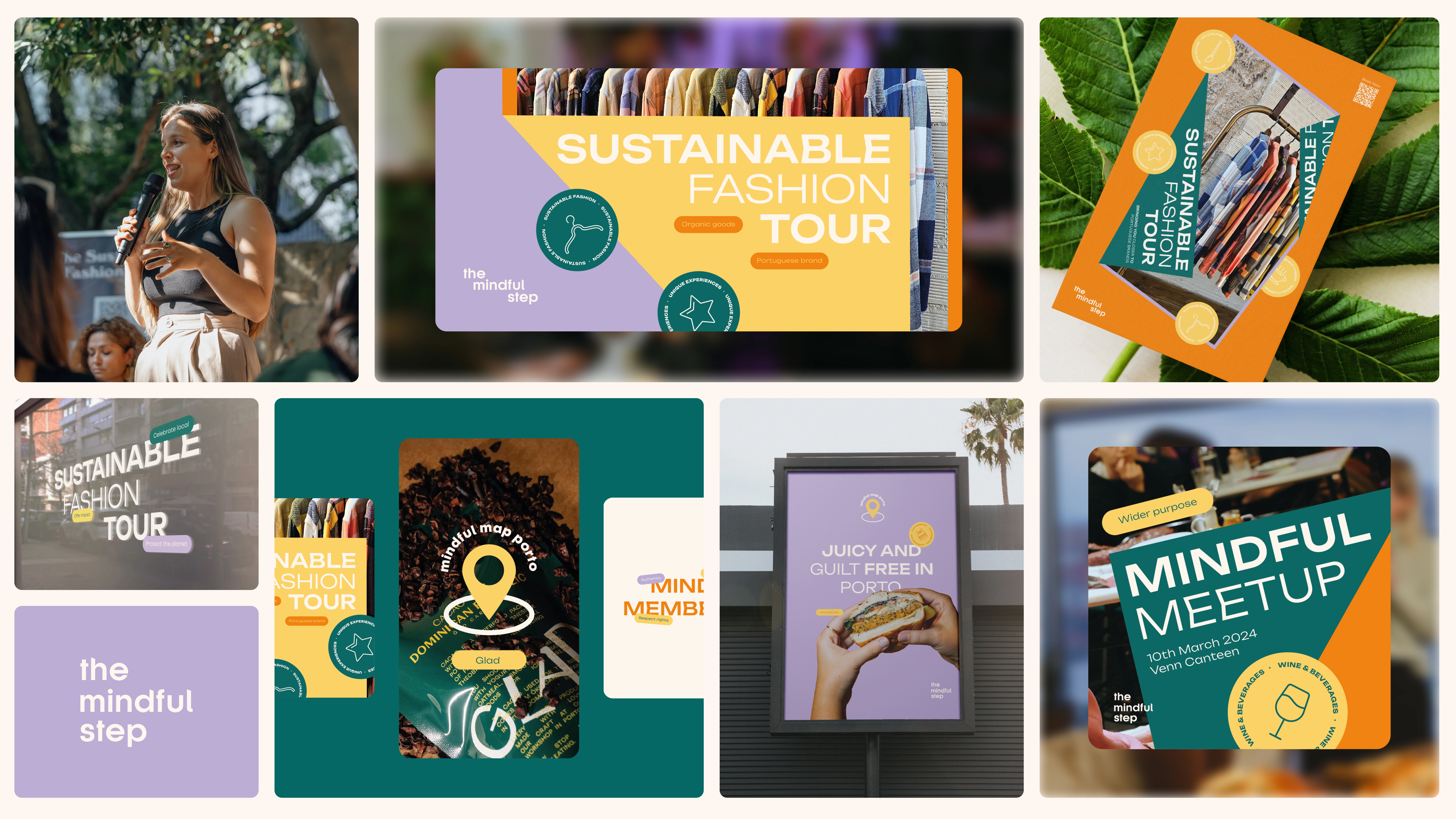
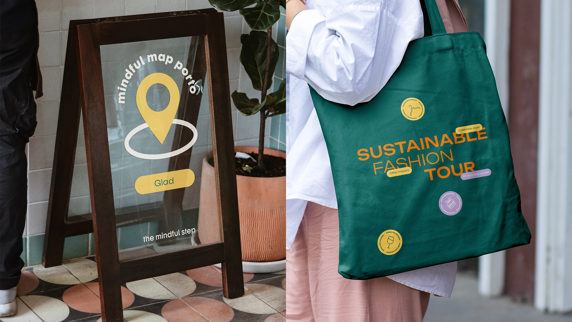
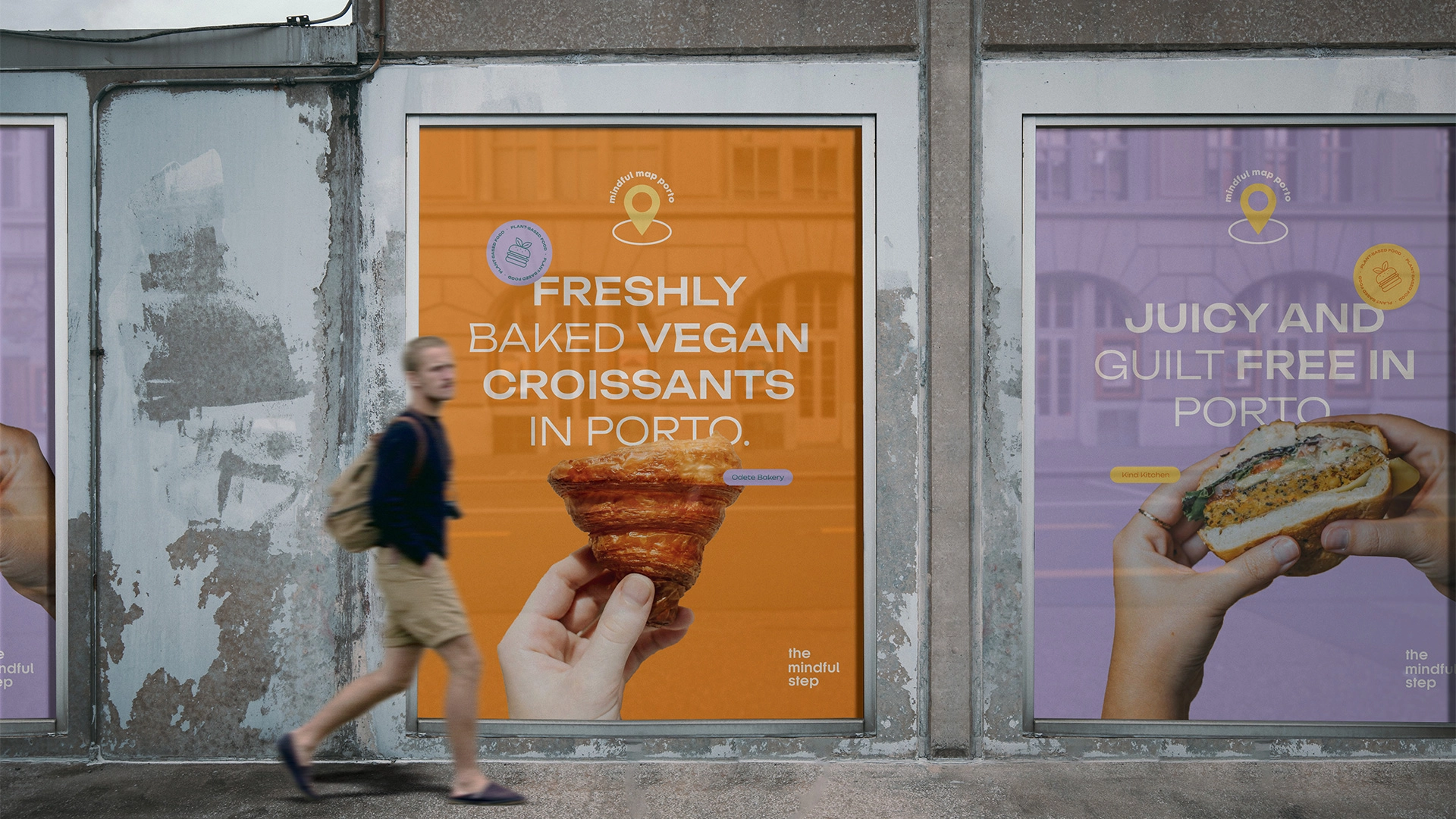
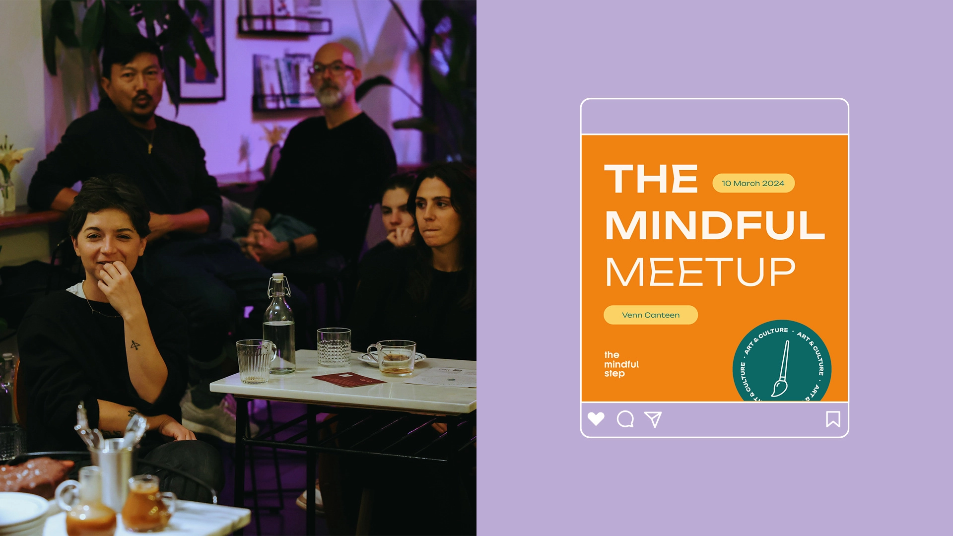
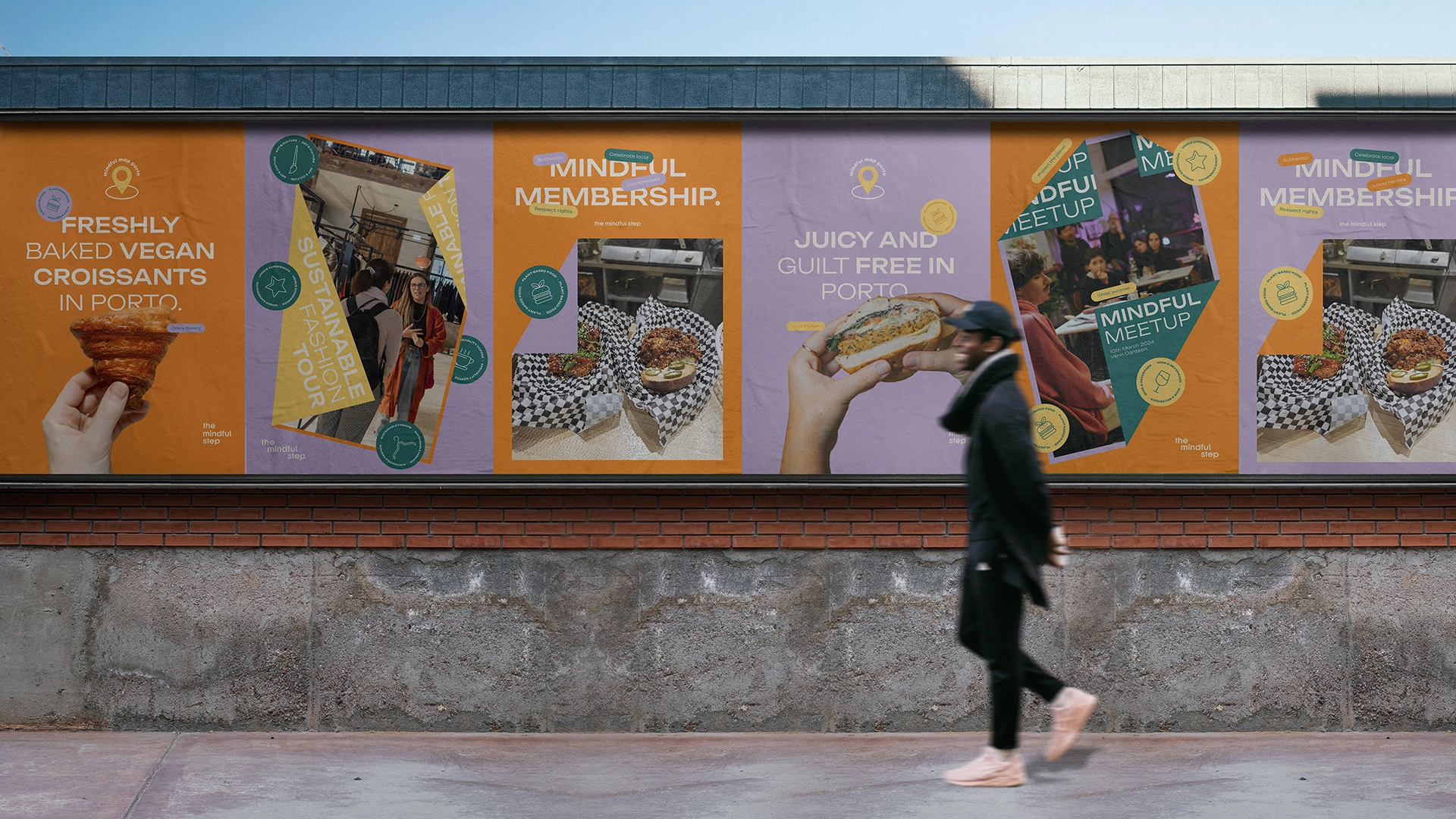
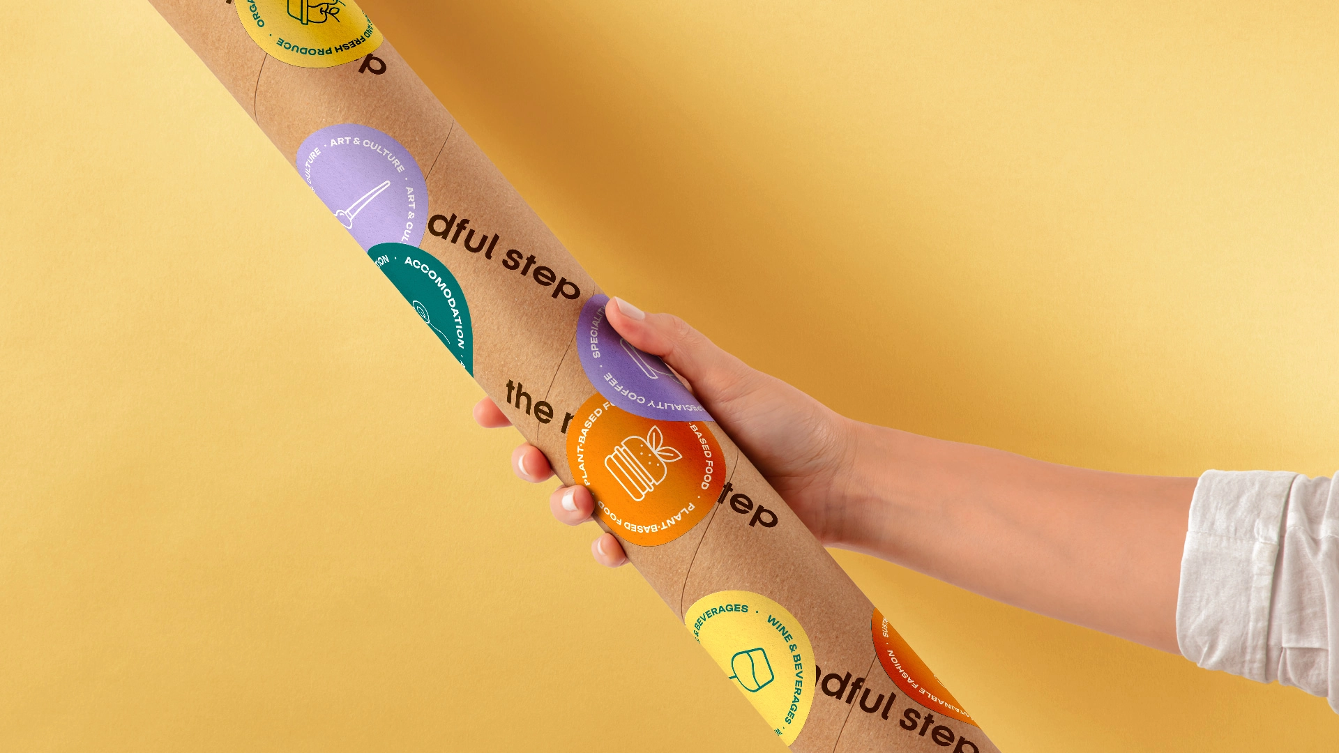
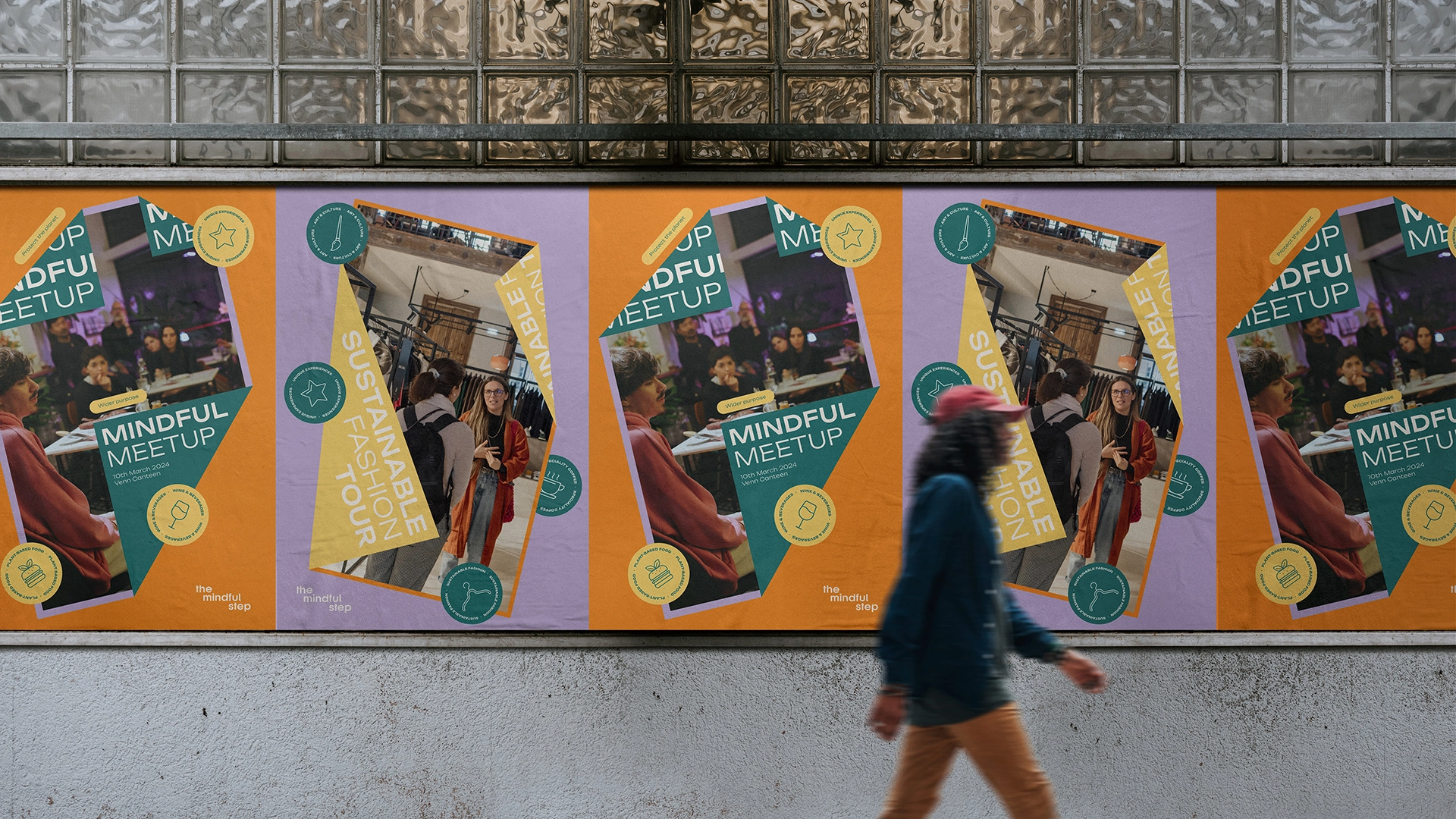
The logo gets updated to a more cleaner san serif look with a new vibrant colour palette, more in line with the owners vision and personality. The Unbounded font gives it it's edge and makes it standout as a contender for a better future. The whole identity is also given an extra hand with a set of stickers adjacent to the map locations and events that TMS offers. Labels with fundamental keywords also make an appearance to add a finishing touch.